Why this matters
Starting with UX/UI designers that consider people with disabilities makes the development process faster and will lead to fewer problems later.
When designers commit to prioritizing accessibility and are able to communicate the desired assistive technology experience to developers, an enterprise is well on its way to creating inclusive experiences.
Team commitment KPIs
What commitments must the team agree to meet if your organization is going to be successful?
What obstacles must be acknowledged and removed for your component library to create inclusive experiences?
What’s covered
- Core responsibilities
- Research & testing
- Layout and structure principles
- Design for blindness
- Design for low vision
- Design for color perception
- Design for photosensitivity
- Design for cognitive differences
Core responsibilities
Can explain why accessibility is a requirement
Team members can possess varying levels of technical understanding, but all should be alert to the basic reasons accessibility is a requirement.
Accessibility target policies
At a minimum, any team needs to understand accessibility targets exist, are defined by enterprise policy and enforced by leadership.
This bare minimum adoption achieves some level of compliance, even when it’s begrudging.
However, if the reasons for accessibility policies are taken to heart in service of the customer, products can dramatically improve.
Living your organization’s values
Accessibility isn’t just the right thing to do, it’s the smartest thing to do.
Every organization has a set of values, often including core ethical tenets like treating people with respect and doing the right thing.
How does accessibility fit those values? How does ignoring accessibility breach them?
A tool for innovation
Accessible design and development builds better products for everyone. When teams put accessibility at the beginning of their processes, they create more valuable products for your enterprise.
Competitive advantage
26% of the US population has a disability that requires accommodation, making people with disabilities the largest minority in the United States. This adds up to billions of dollars in combined purchasing power.
Avoiding legal risk
Accessibility is the law. Designing and building accessibility into products also helps the enterprise avoid legal risk and liability due to a customer complaint.
Knows where to find internal/external policies
It will often fall to individual contributors to explain requirements and policies to others, especially to contractors or 3rd-party partners. Pointing to published policies gives weight to what otherwise might be seen as a preference.
Policies should be published in both simple and legal formats and available to share for:
- Design systems (must accompany design system artifacts)
- Component library (integrated in the documentation)
- Internal company usage (typically in the company intranet)
- External partner and procurement requirements (shareable publicly)
Can use assistive technology
It is important designers know the basic functions of a screen reader. They don’t have to reach the competence of developers and QA testers.
Screenreader basics
- Shortcut to browse by headings
- Shortcut to browse by links
- Shortcut to browse by landmarks
- Browse content with the arrow keys
- Focus interactive elements with the tab key
Knows where to find requirements and policies
It will sometimes fall to individuals to explain requirements and policies to others, especially if they are contractors or 3rd-party partners. Advocating for policies gives weight to what otherwise might be seen as a preference.
Includes people with disabilities in personas
In the UX research phase, designers should capture and describe the goals, needs and any barriers for people with disabilities just like any other demographic.
Annotates deliverables with accessibility notes
Include notes for the desired user experience for people using assistive technology in your design deliverables. Don’t let experiences be left to developer defaults.
Research & testing
When teams design for people with disabilities from the beginning, they create better products for everyone.
Includes people with disabilities in research
Your existing research processes can adapt and improvise to accommodate people. You may need to allow for additional planning and lead time, as well as ensuring any technology (like video conferencing tools) are accessible to your subjects.
Just like any user research project, every finding must be taken in context. Not every person with a disability can universally speak for all, and you will find the occasional problem participant or outlier.
Includes people with disabilities in testing and surveys
This is different from a manual accessibility assessment. Not everyone who uses assistive technology is an expert. There is a wide gamut of technical proficiency, and your testing should include the most basic usage patterns as well as more sophisticated power users.
For customer surveys, you must consult with your legal counsel on what personal information you may collect about people and how to store it safely.
Layout and structure principles
The good news is a lot of accessible patterns have been adopted by designing for mobile first.
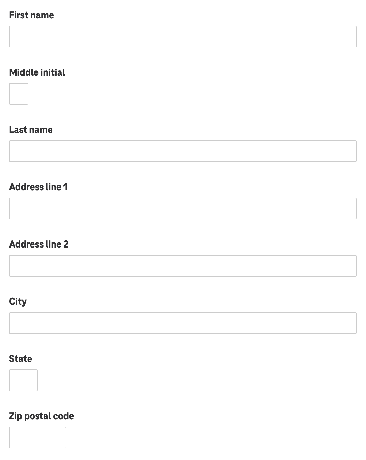
Keep elements vertically stacked and grouped by proximity
Form inputs and labels should not be spread across the page. Establish a vertical stacking of labels and inputs in the design system.
Stacking content vertically on the page does not represent a challenge for people because it’s customary to scroll up and down.
However, people with low vision may zoom in on their screen, meaning they only see a portion of the desktop layout. This makes it easy to miss required inputs on other columns of the layout.
Research consistently shows that stacked vertical layouts convert better and are more intuitive.
Considers simpler ways to convey content
Don’t use a complex interaction when a simple one will do.
Carousels are almost always bad ideas.
- Interaction with any slide beyond the first visible content is invariably low.
- Read Should I use a carousel for more information
Tooltips are always a bad idea
- Tooltips are indicative of poor UX copywriting practices.
- Information contained in tooltips is better served rewritten as a visible hint or as a modal.
Modals are often unnecessary and interruptive.
- Don’t use a modal where an accordion expander or a straightforward link to another page will do.
Dropdown select inputs should be used sparingly.
- Only use where the content order is immediately recognizable by convention (alphabetical or numerical).
- Ex: Choose a state
- Ex: Choose a year
- Use radio inputs if the content contains mixed options (not alphabetical, numerical or logical). instead
Be wary of interactive mashups of controls.
- Combining controls, buttons and interactions is risky.
- Ex: Text inputs between radio buttons
- Ex: A link inside a checkbox label
Design for blindness
Define headings logically
Headings create a skimmable outline
Headings are more than bigger, bolder text. They contain meaning that forms an outline of the page.
- Start with a single
<h1>per page. There must be only one. <h1>is the meaningful title of the page.- Title major sections with
<h2> - Subsections of the
<h2>should be an<h3>. - It should be rare that
<h4>and beyond is required. - Only exceedingly long or extremely complex pages will need
<h5>or<h6>.
Headings example
  <h1>Taco salad recipe</h1>

    <h2>Ingredients</h2>

    <h2>Steps</h2>

      <h3>Vegetable preparation</h3>
      <h3>Grilling the protein</h3>
      <h3>Plating and serving</h3>

    <h2>Nutrition information</h2>

    <h2>Related receipes</h2>
Define alt text for images or icons
Precise alt text conventions should be fine-tuned in your copywriting style guide.
Each image should have alt text for screen readers, unless including it would be annoyingly repetitive.
- Define alt text for images or icons when the image adds editorial meaning to the page.
- Good alt text allows anyone who can’t see the screen to describe it to someone else.
- Leave the alt attribute empty if an icon doesn’t add meaning or would be repetitive.
More of an art than a science
The copywriting style guide should determine a consistent voice for writing alt text and when to leave alt text undefined.
For instance, questions of when to call out gender, race, sexual orientation, etc., can be difficult to answer.
Practical examples
- Describe a banner image of a model using your product.
- Describe an image of your product in a specific color or configuration.
- Don’t describe a generic shoe icon next to a headline that says “Shoes”.
Define aria-label only when necessary
Adding context with aria-label can help a customer using a screen reader understand the action of ambiguous links, buttons and inputs.
Practical examples
- A link to purchase coffee has the visible text “Shop today”. An appropriate aria-label might be “Shop today for coffee”
- A geolocation button features a map pin icon, but no visible text. An appropriate aria-label might be “Find my location”
- A site search input’s only visible label is a button with a magnifying glass. An appropriate aria-label for the search input might be, “Search this site” and the search button could use an aria-label of “Submit search”
Define name, role and states for custom components
Specialized components modifying or combining interactions need clear direction on keyboard and screen reader experience.
Example: Password input
A well-designed password input will include a “show password” option. Upon clicking the button, the password is toggled between visible letters and •••••.
The team should be able to answer:
- When should the screen reader user be notified their password is visible?
- What language should describe the hidden or visible state of the input?
- How will the screen reader declare the “show password” is visible?
Example: Carousel
The team should be able to answer:
- Will the arrow keys operate the carousel?
- Does the spacebar pause the carousel?
- What interactions should be documented with testing instructions?
Design for Low vision
It’s easy to only think about people using a screen reader and not consider people with low vision.
People with low vision often use zoom application tools to enlarge portions of the screen. (Note: This is different from using the browser’s built in zoom settings.)
Associate controls visually
Two interactive components often fail for people with low vision:
Toggle switches
- Toggle switch visuals are often placed on the far right side of the control.
- Instead, place the switch visual on the left side, the same way a checkbox or radio input would be placed.
Accordion expander
- Expander controls are typically a chevron or a +/- button on the far right side.
- Instead, place the visual indicator on the left side, the same way a checkbox or radio input would be placed.
Stack form inputs
- It is a generally accepted best practice to stack labels and form inputs vertically rather than horizontally.
- When forms spread across the page, people with low vision have difficulty finding and completing all the inputs while using a zoom application.
Paragraph typeface is optically 16px or greater
This helps all people consume content, not just those with low vision.
Typeface optical scaling may differ
This precise measurement may have to be adjusted to the scale of the actual rendered typeface.
For example, Arial produces a capital letter “M” rendered at 16px tall. Another typeface may render on screen at 14px, even though the code stipulates font-size: 16px.
Justify text left, never fully justify text
Do not fully justify text, no matter how cool the product owner thinks it looks.
Left justified text is easier to read because the difference in line lengths provides a visual cue for the brain to select the next lines for reading.
Fully justified text creates “rivers” of white space in the paragraphs and interrupts the reading experience.
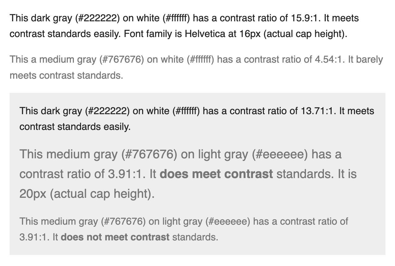
Ensure color contrast meets guidelines
All components should be able to be mixed and matched and still meet contrast requirements.
For people with low vision, high contrast between text and background makes content consumable. Keeping text a comfortable size helps everyone.
Avoid pure black
Don’t use black (#000000) on white (#ffffff) or vice versa as this can create glare, seem to flash or appear to vibrate/move.
Practical examples
- Text size for paragraph text never goes below 16px and has a contrast ratio of 4.5:1 or higher.
- Large text (20px and above) has a contrast ratio of 3:1 or higher.
Design for color perception
Don’t use color as the only means of conveying content.
Practical examples
- A status indicator cannot solely display a green or red dot to indicate being on-track or blocked. It will need text labels to reinforce the meaning for people who may experience color blindness.
- Don’t display color swatches without text labels
Design for motor disabilities
Define experiences for keyboard and switch devices
Not everyone uses a mouse or taps their screen to navigate their device. Some people use their keyboard.
Others with limited mobility may use a switch device, akin to a game controller, mapped to keyboard functions:
- Arrow keys browse content
- Tab key focuses interactive controls
- Spacebar or enter keys are used to activate controls
They traverse the UI sequentially to “focus” on one interactive element at a time.
Define focus order for complex components
It’s important elements are read in logical order for those using a screen reader. Developers will sometimes need the order clearly defined.
- Complex or compact features may need focus order identified for developers.
- The order in which controls logically come into focus matters.
- The default is top to bottom, left to right — just like reading.
If designers don’t precisely define the interactions, developers will often write code in illogical reading order and the feature may not make logical sense to people using their keyboard or screen reader.
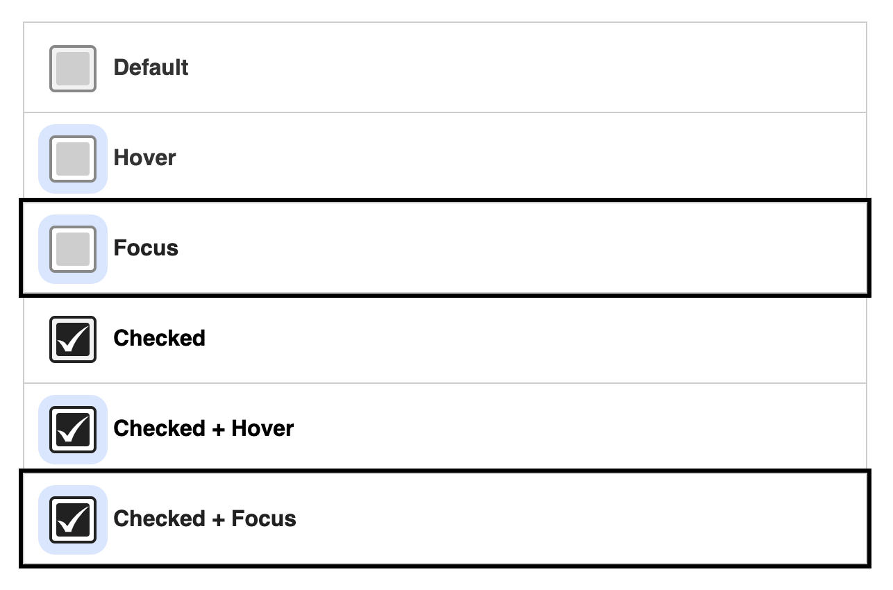
Design for focus states
Include keyboard focus as a default in your design system along with hover, active and other states.
Example: checkbox
At a minimum, a checkbox must have the following states defined:
- Unchecked
- Unchecked + hover
- Unchecked + focus
- Checked
- Checked + hover
- Checked + focus
Clickable area minimum of 44x44px
Encourage generous click/tap target sizes for people with motor disabilities.
The minimum size is 44x44px, but merely meeting the minimum is not the goal.
Design for photosensitivity
Respond to reduced motion settings
Most operating systems have a reduced motion option detectable by web or native applications. Sweeping animations and large special effects should be stopped, but the core content should still be consumable.
Flashing content shouldn’t sequence more than 3x per second
Rethink your decisions if you’re relying on flashing content to emphasize part of your design. Content like this can make people physically ill or even induce seizures.
Video or animations should have controls to be able to quickly pause
Video or animations need obvious controls to be able to quickly pause, stop or hide content.
Design for cognitive differences
Use plain language
Not everyone understands content the same way. Emphasize being clear before being clever in your style guides. Plain language makes content easier for all customers to consume and understand.
- Avoid using idioms or implying jokes. This can be difficult for people who don’t speak english as a first language.
- Avoid technical jargon if a simpler explanation will do
Align names and labels with purpose
- Never use “click here” as a link (nor as an aria-label)
- Ex: Instead of “Click here to get started” use “Get started”
- Name core functionality according to conventions.
- Ex: Don’t name your e-commerce “Cart” “Shopping sleigh” for the holidays.
- Ex: Don’t label a link to purchase a product as “Check it out.” Be clear about the purpose of the link.
Don’t write actionable sounding text that isn’t actionable
Customers will try to click on it and become frustrated if content sounds or looks actionable.
For example, don’t use a “Buy coffee” heading without making it a link to coffee products.