Why this matters
The building blocks of your application must be accessible from the start, though do understand that teams can still assemble those blocks in ways that aren’t accessible.
By aligning the component library with accessibility requirements, you’ll find it’s natural for accessibility to become embedded in your features.
Team commitments KPIs
What commitments must the team agree to meet if your organization is going to be successful?
What obstacles must be acknowledged and removed for your component library to create inclusive experiences?
What’s covered
Core responsibilities
Brief new developers or contractors on the importance of accessibility and what their responsibilities are.
Includes best practices documentation and support
Don’t just hand a component library to a developer. It’s possible to misuse or poorly implement the building blocks.
The design system contains more than components for use; it also must include the correct methods and testing instructions.
Developers also need to know the component library team is there to answer questions and support them with implementation.
Includes accessibility requirements and policies
Component libraries should clearly publish accessibility requirements and link to policies.
This helps train developers and supports those who are doing the right thing, especially amid resistance to best practices from stakeholders.
Establishes help channels
The component library team provides help for implementing interfaces. Developers will often need guidance to use the correct components and understand different contexts.
This could take the form of Slack channels, office hours or regular reviews.
Defines interactions for custom components
Specialized components modifying or combining interactions need clear direction on keyboard and screen reader experience.
Example: Password input
A well-designed password input will include a “show password” option. Upon clicking the button, the password is toggled between visible letters and •••••.
The team should be able to answer:
- When should the screen reader user be notified their password is visible?
- What language should describe the hidden or visible state of the input?
- How will the screen reader declare the “show password” is visible?
Example: Carousel
The team should be able to answer:
- Will the arrow keys operate the carousel?
- Does the spacebar pause the carousel?
- What interactions should be documented with testing instructions?
Technical capabilities
Each component needs to account for accessibility by default. But, just as important, you need to understand the patterns in which they are used.
For example, the component library may have heading components for page and section titles to meet contrast guidelines. But if the headings are used out of logical order, they are not helping the customer experience.
Decouples headings from styles
Component libraries must decouple styles and style names from heading levels, allowing h1, h2, or h3 to be sized with CSS independent of their headings.
When heading level is directly coupled to size, developers will use headings out of logical order to simply make text bigger or smaller, rather than using them with their semantic purpose.
Naming conventions:
- NATO alphabet (alfa, bravo, charlie, delta, echo, foxtrot)
- Greek letters (alpha, beta, gamma, delta, upsilon, zeta)
- Size based (gigantic, huge, large, medium, normal)
This kind of pattern allows for text other than headings to be sized large without adding unwanted semantic meaning.
Practical example:
<h1 class="large">About our coffees</h1>
<p class="gigantic">All beans are on sale</p>
Allows for appropriate alt text
Precise alt text conventions should be fine-tuned in your copywriting style guide.
Each image should have alt text for screen readers, unless including it would be annoyingly repetitive.
- Define alt text for images or icons when the image adds editorial meaning to the page.
- Good alt text allows anyone who can’t see the screen to describe it to someone else.
- Leave the alt attribute empty if an icon doesn’t add meaning or would be repetitive.
More of an art than a science
The copywriting style guide should determine a consistent voice for writing alt text and when to leave alt text undefined.
For instance, questions of when to call out gender, race, sexual orientation, etc., can be difficult to answer.
Practical examples
- Describe a banner image of a model using your product.
- Describe an image of your product in a specific color or configuration.
- Don’t describe a generic shoe icon next to a headline that says “Shoes”.
Contrast & text size
All components should be able to be mixed and matched and still meet contrast requirements.
For people with low vision, high contrast between text and background makes content consumable. Keeping text a comfortable size helps everyone.
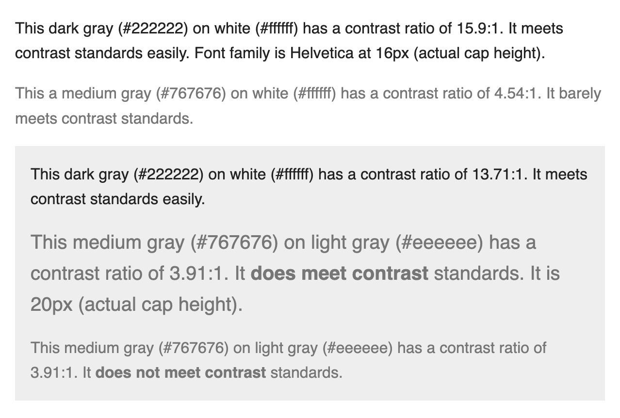
Avoid pure black
Don’t use black (#000000) on white (#ffffff) or vice versa as this can create glare, seem to flash or appear to vibrate/move.
Practical examples
- Text size for paragraph text never goes below 16px and has a contrast ratio of 4.5:1 or higher.
- Large text (20px and above) has a contrast ratio of 3:1 or higher.
Accounts for color perception
Don’t use color as the only means of conveying content.
Practical examples
- A status indicator cannot solely display a green or red dot to indicate being on-track or blocked. It will need text labels to reinforce the meaning for people who may experience color blindness.
- Don’t display color swatches without text labels
Uses large clickable target size
Encourage generous click/tap target sizes for people with motor disabilities.
The minimum size is 44x44px, but merely meeting the minimum is not the goal.
Includes focus states
Include keyboard focus as a default in your design system along with hover, active and other states.
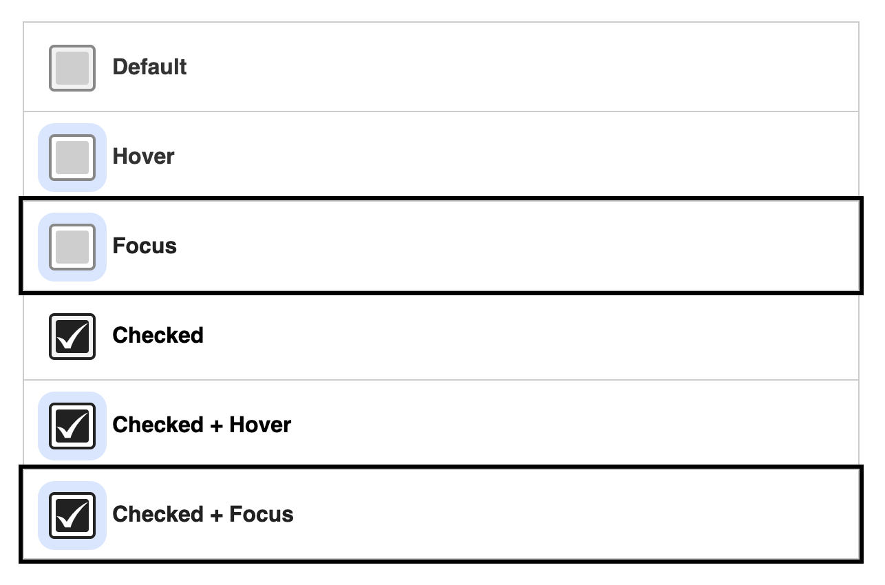
Example: checkbox
At a minimum, a checkbox must have the following states defined:
- Unchecked
- Unchecked + hover
- Unchecked + focus
- Checked
- Checked + hover
- Checked + focus
Responds to reduced motion settings
Reduce, pause, or eliminate animations when a device’s reduced motion settings are active.
Practical examples
- Replace an animated background with a still image.
- Flashy interaction effects are reduced to minimal transitions.