Make policies applicable, consumable and practical
These 12 requirements are broken into 2 categories:
- 9 “Do these things”
- 3 “Don’t do these things”.
They cover most of WCAG AA compliance in plain language.
This is not a complete list of every conceivable accessibility requirement. These are the most common mistakes and misses in digital products that lead to risk and compliance issues.
What these plain language policies are
This is a starting point for discussion. The most important thing a policy does is start a discussion and trigger the need for changing processes.
Many people are completely unfamiliar with accessibility or assistive technology. Beginning a discussion about policies with WCAG success criterion is not going to accomplish your aims.
What these plain language policies are not
Don’t mistake these as lightweight requirements. This is not an easy ask for a digital product team, especially if it has never heard of accessibility and is writing poor quality code.
For instance, the first two requirements encompass almost all of WCAG level A and many of AA success criteria.
This is also not a QA test case checklist. This is a list of rules around which to discuss minimum compliance with teams. Detailed checklists are available from AtomicA11y.com.
Do these things
1. Using only a keyboard (no mouse) all interactive elements (links, buttons, inputs) are intuitively and visibly functional.
This is a crucial first test of any digital product, and it’s necessary for screen readers as well.
Practical examples
- Links are visibly focused using the tab key and activate with the enter key.
- Menu buttons are visibly focused using the tab key and activate with the enter key or spacebar.
- Radio buttons are visibly focused using the tab key and selected with the arrow keys.
- Checkboxes are visibly focused using the tab key and selected with spacebar.
- The arrow keys browse content and elements that are not interactive (plain text or headings) are not focusable with the tab key.
2. All features have appropriate names, roles and states for screenreaders
Digital applications are made of code. Code has important meaning to screen readers. Just because a website works with the keyboard doesn’t mean it describes what’s happening to the screen reader.
Practical examples
- An address input field is labeled “Street address,” expresses its role as text input, and declares it’s required.
- An accordion expander button names the content it controls, expresses its role as a button, and its state as expanded or collapsed.
- A radio button is named by its label, expresses its role as one of a group of radio buttons, and its state as selected or unselected.
3. Media that aid in understanding the content of the page must have alternative text
Most images should have alt text for screen readers, unless doing so would be annoyingly repetitive.
Practical examples
- Use alt text to:
- Describe a banner image of a model using your product
- Describe an image of your product in a specific color or configuration
- Provide captions on a video with spoken audio
- Examples when not to use alt text:
- Ignore a shoe icon next to a text headline of “Shoes”
- Ignore a generic info icon next to hint text
4. Use headings to structure the page
Headings aren’t just big text. They add logical meaning for screen readers.
Start with a singular <h1> (heading level 1); major sections start with <h2> (heading level 2) and subsections with <h3> (heading level 3).
These occur in sequence, not skipping a heading level.
Practical examples
<h1>My favorite taco recipe<h2>Ingredients<h3>Spices<h3>Protein<h3>Vegetables
<h2>Steps<h3>Preparing the protein<h3>Preparing the vegetables<h3>Assembly and plating
<h2>Nutrition information<h2>Related recipes
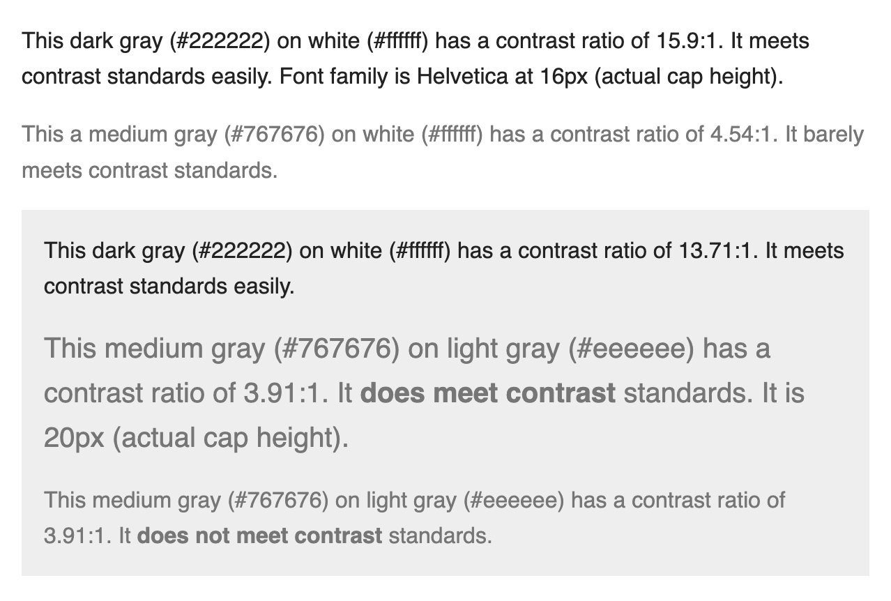
5. Contrast, color and size of text and controls must be easily distinguishable
All components should be able to be mixed and matched and still meet contrast requirements.
For people with low vision, high contrast between text and background makes content consumable. Keeping text a comfortable size helps everyone.
Avoid pure black
Don’t use black (#000000) on white (#ffffff) or vice versa as this can create glare, seem to flash or appear to vibrate/move.
Practical examples
- Text size for paragraph text never goes below 16px and has a contrast ratio of 4.5:1 or higher.
- Large text (20px and above) has a contrast ratio of 3:1 or higher.
6. Use HTML landmarks to improve navigation for screenreaders
Web pages almost always require 4 major landmarks: header, navigation, main and footer. These are identifiable with screen reader shortcuts.
Practical examples
- Header: Contains the site title and sometimes the navigation
- Navigation: Contains the links to the top level pages
- Main: Contains the main content of the page
- Footer: Contains legal information and often another navigation element
7. Feature multiple ways to find information
There should not be only one way to find content in your application.
Practical examples
- An intuitive search feature makes all content available by keyword.
- Top level pages contain links to next level pages of the information architecture.
- The footer may contain a comprehensive navigation to top level pages.
- A sitemap contains organized links to every page.
8. Required fields are indicated visually and in the code
It’s not enough to put an asterisk next to a required field. Fields necessary to advance must include required attributes in the code to identify as being required.
Practical examples:
- The word “required” or “*” asterisk is included as part of an input field’s label
- A required input uses the required attribute
9. Offer programmatic hints and suggest ways to correct errors
Some input fields benefit from hints that aid in understanding what’s expected. When invalid data is entered, explain what is wrong and how to fix it. These hints and errors should be automatically read by a screen reader when the input is in focus.
Practical examples
- A date input hint explains, “The date must use DD/MM/YYYY format”
- A date input error explains, “You must enter a valid date. The date must use DD/MM/YYYY format”
Don’t do these things
10. Don’t use media that flash more than 3x/second
People with photosensitivity can experience sickness from certain types of visuals.
Any media/animation with a strong flash/strobe more than 3 times per second should never be used unless it is tested by experts before launch.
Practical examples
- Do not use a GIF rapidly flashing “New!”
- Do not use a video featuring a repeating flashing light more than 3 times per second.
11. Don’t trap the keyboard user
A person using a keyboard cannot become lost, trapped or unable to continue.
Practical examples
- Inputs, buttons or links are always clearly visually indicated when in focus.
- When a modal dialog opens, the content behind the modal should remain inert until the modal is closed. Don’t allow interaction with content behind the modal.
- Focus should always start at the top of a new page. Don’t alter the order by placing focus on forms or other controls in the page.
12. Don’t play audio or video media automatically
Absolutely never ever autoplay audio content. Don’t do it. Don’t. Audio that plays automatically and unexpectedly is terribly disruptive for people using screen readers.
To reiterate: There is never a good reason for automatically playing audio.
Never automatically play a silent video longer than 5 seconds without an immediately intuitive way to pause it. Video that plays automatically can make people with vestibular disorders seriously ill. It’s also a nuisance for people using a keyboard if the controls are difficult to find.
Practical examples
- Detect the device operating system “reduced motion settings” to disable autoplay media entirely.
- A banner containing a video sample plays for 5 seconds on page load then stops or has a large very accessible pause button.